
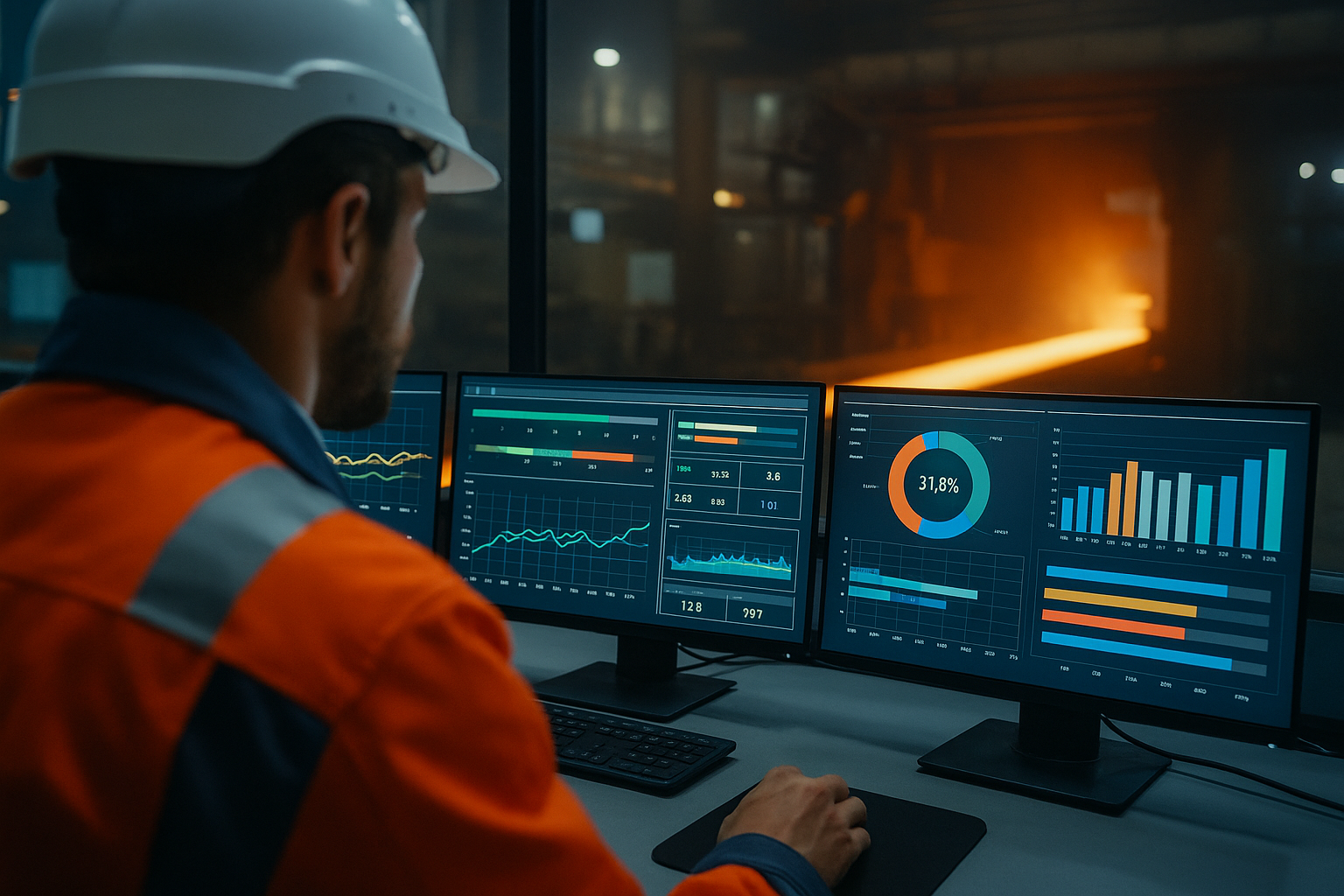
Steel plants generate enormous volumes of operational data every second.
Furnace temperatures, rolling forces, strip thickness, line speed, vibration, energy consumption, chemical composition, equipment status, quality deviations, production orders and hundreds of other variables are continuously measured across the production process.
But collecting data is not the same as using data.
A plant can have thousands of sensors, sophisticated automation systems and years of historical records while still making critical operational decisions through spreadsheets, isolated reports, radio calls and individual experience.
The real challenge is converting industrial data into timely, reliable and actionable information.
This is where digital dashboards become strategically important.
A well-designed industrial dashboard does much more than display charts. It connects process information with production objectives, exposes deviations, creates a common operational picture and helps operators, engineers and managers decide what requires attention.
The objective is not to display more data.
It is to improve decisions.
1. Why Steel Plants Need Better Operational Visibility
Steelmaking is a highly interconnected manufacturing system.
A deviation occurring upstream can create consequences several process stages later.
Variation in raw materials can influence furnace performance. Casting instability can affect slab quality. Reheating conditions can influence rolling behavior. Rolling parameters can affect dimensional tolerances, surface quality and downstream processing.
Maintenance conditions influence availability.
Energy performance influences conversion cost.
Quality deviations influence yield.
Production sequencing influences delivery performance.
For this reason, isolated departmental indicators provide only a partial view of plant performance.
Management needs to understand not only what happened, but also:
- where it happened;
- when it started;
- how large the deviation is;
- whether it is getting worse;
- what production orders are affected;
- what other variables changed simultaneously;
- who should respond; and
- whether corrective action worked.
A digital dashboard should help answer these questions quickly.
2. A Dashboard Is the Visible Layer of a Much Larger System
One of the most common mistakes in industrial digitalization is treating the dashboard as the project itself.
It is not.
The dashboard is only the visible layer of an information architecture.
A simplified structure can be represented as:
Physical process → Sensors and automation → Data acquisition → Historian/MES → Contextualization → Analytics → Dashboard → Human decision → Operational action
Every layer matters.
If measurement is unreliable, visualization will be unreliable.
If timestamps are inconsistent, correlations can be misleading.
If production context is missing, a temperature value may have little meaning.
If KPI definitions differ between departments, management may compare numbers that were calculated differently.
And if nobody is responsible for responding to an alert, displaying it creates little value.
The quality of the decision can never consistently exceed the quality of the information system supporting it.
3. The Industrial Data Hierarchy
Steel companies frequently operate several information layers simultaneously.
Level 1 — Process measurement
This includes field-level information such as:
- temperature;
- pressure;
- flow;
- speed;
- current;
- voltage;
- vibration;
- position;
- thickness;
- flatness;
- chemical analysis; and
- equipment status.
These signals originate from sensors, instruments, drives, analyzers and machine systems.
Level 2 — Control systems
PLCs, DCS and SCADA systems use process information to monitor and control equipment.
Their primary responsibility is generally safe and stable process operation, not enterprise analytics.
Level 3 — Operational data infrastructure
Historians and industrial data platforms store time-series information and make historical analysis possible.
Modern architectures can also contextualize data according to assets, events, batches or production units.
Industrial platforms such as the AVEVA PI System are designed around this type of collection, storage, contextualization and visualization of operational data.
Level 4 — Manufacturing systems
MES and related applications add production context:
- order;
- product;
- heat;
- slab;
- coil;
- grade;
- route;
- customer;
- shift;
- production status; and
- quality disposition.
Level 5 — Business systems
ERP and planning systems introduce commercial and financial context such as:
- customer order;
- inventory;
- purchasing;
- production planning;
- delivery;
- standard cost; and
- financial information.
A powerful dashboard may combine information from several of these levels.
4. The Difference Between Data, Information and Decision
Consider a rolling mill.
A sensor reports:
Rolling force = 18.4 MN
That is data.
The dashboard shows that rolling force is 8% above the expected operating envelope for the current product family.
That is information.
The system shows that the deviation started immediately after a roll change and is correlated with increasing thickness variation.
That is contextualized information.
The operator decides to verify roll setup before additional coils are processed.
That is a decision.
The team corrects the setup and rolling force returns to its normal operating envelope.
That is operational action.
The value of digitalization appears primarily in the last two steps.
5. What Makes a KPI Operationally Useful?
Not every measurable variable deserves to become a KPI.
A useful KPI should satisfy several conditions.
It should have:
- a clear operational definition;
- a reliable data source;
- an identified owner;
- an appropriate update frequency;
- an expected or target condition;
- defined deviation limits;
- a relationship with an operational or business objective; and
- a corresponding management response.
Consider yield.
If different departments calculate yield using different boundaries, the dashboard can create disagreement rather than transparency.
A KPI dictionary should therefore define items such as:
| KPI element | Definition |
|---|---|
| KPI name | Metallic yield |
| Process boundary | Input material to saleable output |
| Calculation | Saleable output / metallic input |
| Unit | % |
| Frequency | Shift / daily / monthly |
| Data owner | Production |
| Data source | MES + weighing system |
| Target | Defined by product/process |
| Escalation | Investigate deviation beyond agreed threshold |
This governance work is less visible than dashboard design, but often more important.
6. Leading Indicators and Lagging Indicators
A strong dashboard should distinguish between results and signals.
Lagging indicators describe outcomes that have already occurred.
Examples include:
- monthly yield;
- tons produced;
- total downtime;
- energy consumption per ton;
- customer complaints;
- scrap rate; and
- maintenance cost.
Leading indicators provide earlier evidence that performance may deteriorate.
Examples include:
- vibration trend;
- bearing temperature;
- increasing process variability;
- growing maintenance backlog;
- repeated minor stops;
- declining first-pass yield;
- abnormal energy intensity; and
- process parameters approaching control limits.
Management needs both.
A dashboard containing only lagging KPIs becomes a sophisticated rear-view mirror.
7. Production Dashboards
Production dashboards should help teams understand whether the plant is producing according to plan.
Typical indicators include:
- tons/hour;
- actual versus planned production;
- equipment availability;
- utilization;
- production sequence;
- bottleneck status;
- cycle time;
- delay categories;
- work-in-process;
- campaign progress; and
- schedule adherence.
But simply placing all these numbers on one screen is not enough.
The dashboard should emphasize exceptions.
If production is on target, the operator does not need ten visual warnings confirming normality.
Attention should be directed toward deviations requiring intervention.
8. Quality Dashboards
Quality dashboards connect process conditions with product conformity.
Typical metrics may include:
- first-pass yield;
- rejection rate;
- downgrade rate;
- rework;
- dimensional deviations;
- surface defects;
- laboratory results;
- defect frequency by product;
- defect frequency by line;
- customer claims; and
- cost of poor quality.
The most useful systems allow users to move from the KPI toward the underlying process history.
For example:
Higher rejection rate → defect family → affected products → affected production period → process variables → potential causes
This turns the dashboard from a reporting tool into an engineering investigation tool.
9. Maintenance and Reliability Dashboards
Maintenance dashboards should not merely display the number of open work orders.
They should support reliability decisions.
Relevant indicators include:
- equipment availability;
- MTBF;
- MTTR;
- planned versus unplanned maintenance;
- maintenance backlog;
- critical overdue work orders;
- repeat failures;
- condition-monitoring alarms;
- lubrication status;
- vibration trends;
- temperature trends; and
- spare-parts constraints.
The relationship between dashboards and predictive maintenance is particularly important.
Condition-monitoring systems can identify deterioration before functional failure, but the information must reach the correct decision-maker in a usable form.
A dashboard can integrate equipment condition, production criticality and maintenance planning so that teams prioritize intervention based on risk rather than simply responding to the latest alarm.
10. Energy Dashboards
Energy is a major conversion-cost component in steel production.
Energy dashboards may track:
- electricity consumption;
- natural gas consumption;
- oxygen;
- compressed air;
- steam;
- fuel;
- peak electrical demand;
- energy intensity per ton;
- energy consumption by product family; and
- deviation from expected process consumption.
The key metric is often not absolute consumption.
A plant producing more steel will naturally consume more energy.
The relevant question is frequently:
How much energy was required per unit of useful production under comparable operating conditions?
Normalization is therefore essential.
Energy performance can be compared by:
- ton;
- heat;
- coil;
- product family;
- grade;
- furnace campaign;
- operating hour; or
- other technically appropriate production units.
11. Yield and Material-Efficiency Dashboards
Yield is one of the strongest economic indicators in steel manufacturing because relatively small percentage changes can represent substantial annual tonnage.
A material-efficiency dashboard can track:
- metallic yield;
- crop losses;
- scale losses;
- scrap generation;
- downgraded production;
- rework;
- edge trimming;
- over-thickness;
- under-thickness;
- process loss by stage; and
- loss by product family.
The dashboard should allow management to translate percentage losses into physical and economic consequences.
A 0.5 percentage-point deterioration may appear small on a screen.
Converted into annual tons and monetary value, it may become a major improvement priority.
12. OEE Requires Careful Interpretation in Steelmaking
Overall Equipment Effectiveness can be useful, but it should not be applied mechanically.
OEE combines:
Availability × Performance × Quality
The concept works particularly well for repetitive manufacturing equipment with clearly defined ideal cycle rates.
Steelmaking includes continuous, semi-continuous and batch processes where product mix, campaign structure, metallurgical constraints and process routes can complicate interpretation.
Therefore, management should avoid comparing OEE values across fundamentally different assets without understanding the calculation boundaries.
In some steel operations, separate indicators for availability, throughput, yield and schedule performance provide greater decision value than one consolidated OEE percentage.
13. The Importance of Time Context
Industrial data is highly dependent on time.
When investigating a deviation, engineers may need to know:
- what happened immediately before the event;
- which material was being processed;
- whether a maintenance intervention had recently occurred;
- whether another variable changed simultaneously; and
- whether the same pattern occurred previously.
Accurate timestamping and synchronization are therefore fundamental.
Without consistent time context, correlations between different systems can become unreliable.
14. Product Context Is Equally Important
Time-series data alone cannot fully explain production performance.
A temperature of 1,200°C may be appropriate for one process condition and abnormal for another.
Dashboards should therefore connect process information to manufacturing context.
Depending on the process, this may include:
- heat number;
- slab ID;
- coil ID;
- steel grade;
- dimensions;
- customer specification;
- production route;
- rolling schedule;
- furnace recipe;
- shift; and
- equipment configuration.
This contextualization is what allows operational data to become manufacturing intelligence.
15. From Static Limits to Operating Envelopes
Simple dashboards often use fixed thresholds:
- green = normal;
- yellow = warning;
- red = abnormal.
This is useful but can be overly simplistic.
The correct operating range may depend on:
- steel grade;
- thickness;
- width;
- line speed;
- product route;
- furnace condition;
- equipment configuration; or
- ambient conditions.
A more mature system therefore evaluates variables against context-specific operating envelopes.
The question becomes not:
Is this value above 100?
but:
Is this value abnormal for the product and operating condition currently being processed?
That distinction can substantially reduce false alarms.
16. Alarm Management: More Alerts Are Not Better
Industrial teams can become overwhelmed by alarms.
If hundreds of alerts are continuously generated, operators may stop distinguishing critical events from routine noise.
This creates alarm fatigue.
A useful alert should normally answer four questions:
- What happened?
- How important is it?
- What asset or production is affected?
- What action is expected?
Priority should reflect operational consequence.
An alert that requires no action should be questioned.
A dashboard should support attention management, not compete for attention.
17. The Operator Dashboard and the Executive Dashboard Should Not Be the Same
Different organizational levels make different decisions.
Operator
Needs immediate process information.
Typical horizon:
seconds to minutes
Shift supervisor
Needs production and exception management.
Typical horizon:
minutes to hours
Process engineer
Needs trends, correlations and technical analysis.
Typical horizon:
hours to weeks
Maintenance manager
Needs asset risk and work prioritization.
Typical horizon:
days to months
Plant manager
Needs integrated operational performance.
Typical horizon:
daily to monthly
Corporate management
Needs strategic performance and cross-site comparison.
Typical horizon:
monthly to annual
Trying to serve all these users with the same dashboard usually produces an overcrowded screen.
18. A Practical Dashboard Hierarchy
A useful architecture is:
Level 1 — Plant overview
Shows only the most important indicators.
Examples:
- safety status;
- production versus plan;
- critical downtime;
- yield;
- quality;
- energy intensity;
- delivery performance.
Level 2 — Process area
Examples:
- steelmaking;
- continuous casting;
- hot rolling;
- cold rolling;
- coating;
- finishing.
Level 3 — Asset or process detail
Examples:
- furnace;
- caster strand;
- rolling stand;
- gearbox;
- annealing furnace;
- coating section.
Level 4 — Engineering analysis
Provides detailed trends, event history, process variables and diagnostic information.
This hierarchy allows management to move from symptom to cause without presenting every detail simultaneously.
19. The Dashboard Should Answer “What Changed?”
A highly useful management question is:
What changed since the previous shift, day or week?
Instead of forcing managers to visually inspect dozens of KPIs, dashboards can highlight:
- largest deteriorations;
- largest improvements;
- new abnormal conditions;
- repeated deviations;
- newly critical assets;
- production behind schedule; and
- unresolved actions.
This exception-based approach improves management efficiency.
20. Shift Handover Is a High-Value Application
Shift handovers are vulnerable to information loss.
Important details may remain in:
- handwritten notes;
- spreadsheets;
- messaging applications;
- radio conversations;
- emails; or
- individual memory.
A digital handover dashboard can consolidate:
- current production status;
- equipment unavailable;
- quality holds;
- maintenance interventions;
- abnormal operating conditions;
- pending actions;
- safety restrictions; and
- next production priorities.
The objective is continuity of operational awareness.
21. Dashboards Should Connect Problems to Actions
A common weakness is that dashboards show deviations but do not record what happened afterward.
A more mature structure connects:
Deviation → Investigation → Responsible person → Action → Deadline → Verification
For example:
| Deviation | Responsible | Action | Deadline | Status |
|---|---|---|---|---|
| Energy intensity above target | Process engineer | Review furnace operating profile | Today | Open |
| Repeated gearbox vibration | Maintenance | Inspect bearing condition | 24 h | In progress |
| Thickness variation | Rolling team | Verify control parameters | Immediate | Completed |
This transforms visibility into management discipline.
22. Data Quality Must Be Managed Explicitly
A beautifully designed dashboard can display incorrect information with extraordinary efficiency.
Industrial data may be compromised by:
- sensor drift;
- calibration problems;
- communication failures;
- incorrect tag mapping;
- duplicated data;
- manual entry errors;
- missing timestamps;
- wrong units;
- incorrect production associations; and
- inconsistent KPI calculations.
Critical dashboards should therefore include data-quality controls.
Users need to distinguish between:
process abnormality and measurement abnormality.
Otherwise, teams may take process action based on a faulty instrument.
Reliable dashboards depend on trustworthy operational data, especially when real-time data monitoring is used to support production and process decisions.
23. Create a Single Definition of Each Critical KPI
Suppose production calculates yield using shipped tonnage while operations calculates it using good production and finance uses another period boundary.
All three numbers may be mathematically correct.
But the organization does not have one KPI.
It has three different definitions with the same name.
A KPI governance system should establish:
- formula;
- numerator;
- denominator;
- process boundary;
- exclusions;
- units;
- time basis;
- source system;
- owner; and
- revision control.
This is fundamental for trustworthy dashboards.
24. IT/OT Integration Creates Value — and Risk
Modern dashboards increasingly connect operational technology with broader information systems.
That connectivity allows industrial data to support enterprise analytics and decision-making.
It also creates cybersecurity implications.
NIST guidance emphasizes that OT systems have specific performance, reliability and safety requirements and require security controls appropriate to industrial environments.
NIST has also highlighted that increasing IT/OT connectivity can increase exposure to attacks capable of compromising industrial control systems and operational data.
Dashboard architecture must therefore be designed with cybersecurity from the beginning.
25. Cybersecurity Requirements for Industrial Dashboards
Relevant controls can include:
- network segmentation;
- controlled IT/OT interfaces;
- role-based access;
- authentication;
- authorization;
- secure remote access;
- logging;
- asset inventory;
- change management;
- backup;
- recovery planning;
- patch-management procedures;
- anomaly monitoring; and
- protection of data integrity.
The objective is not merely protecting confidential information.
In an industrial environment, compromised information can influence physical operations.
NIST’s 2026 work on manufacturing cybersecurity also emphasizes response and recovery because prevention alone cannot eliminate operational cyber risk.
26. The Difference Between Visualization and Control
A dashboard should not automatically be treated as a process-control interface.
Visualization and process control have different risk requirements.
A business-intelligence dashboard displaying production performance does not necessarily need the ability to change PLC parameters.
Maintaining appropriate separation between information access and control capability can reduce operational and cybersecurity risk.
Read-only access is sufficient for many management applications.
27. Mobile Dashboards Require Additional Discipline
Mobile access can improve responsiveness for managers and maintenance teams.
But not every process variable should be exposed through every device.
Questions should include:
- Who needs mobile access?
- Which data is required?
- Is the access read-only?
- How is authentication managed?
- Can access occur outside the plant network?
- What happens if a device is lost?
- Are critical actions permitted remotely?
Convenience should not override operational security.
28. Dashboards and Predictive Maintenance
Predictive-maintenance systems can generate large amounts of condition data.
Typical variables include:
- vibration;
- temperature;
- oil condition;
- electrical signatures;
- acoustic information;
- pressure; and
- operating load.
The dashboard should convert these signals into equipment risk.
A maintenance manager usually does not need to see every vibration spectrum simultaneously.
The manager needs to know:
- which asset is deteriorating;
- how quickly;
- how critical the asset is;
- what production consequence exists;
- whether maintenance can be planned; and
- what evidence supports the recommendation.
Engineering detail should remain available through drill-down.
This connection becomes even more valuable when dashboard information is integrated with equipment lifecycle management and long-term asset reliability decisions.
29. Dashboards and Root Cause Analysis
Dashboards do not automatically identify root causes.
Correlation is not causation.
If a quality defect increases simultaneously with a temperature change, the temperature change may be:
- the cause;
- a consequence;
- a related process response; or
- unrelated.
Dashboards are excellent tools for narrowing investigations.
Root-cause confirmation still requires engineering knowledge, process understanding and appropriate analytical methods.
30. Dashboards and Artificial Intelligence
AI can extend dashboard capability by identifying:
- anomalies;
- multivariable patterns;
- abnormal operating states;
- failure precursors;
- quality-risk patterns;
- energy inefficiencies; and
- production deviations.
But AI does not eliminate the fundamental requirements of industrial data management.
Poor data plus sophisticated analytics still produces unreliable conclusions.
A sensible maturity sequence is:
Reliable measurement → Contextualized data → Stable KPIs → Useful dashboards → Advanced analytics → AI-assisted decisions
Skipping the early stages usually increases project risk.
31. Digital Dashboards Should Support Standard Work
Dashboards create more value when embedded into management routines.
Examples include:
- shift meetings;
- daily production meetings;
- maintenance planning;
- quality reviews;
- energy reviews;
- weekly performance meetings; and
- monthly management reviews.
The dashboard should become the shared factual basis for discussion.
Instead of debating whose spreadsheet is correct, teams can focus on what action is required.
32. A Daily Steel Plant Management Dashboard
A plant-level daily dashboard might contain:
| Dimension | Example KPI | Management question |
|---|---|---|
| Safety | Incidents / critical conditions | Is the plant operating safely? |
| Production | Actual vs plan | Are we meeting schedule? |
| Availability | Critical asset downtime | What is constraining production? |
| Quality | First-pass yield | Are we producing conforming material? |
| Yield | Metallic yield | Where are material losses occurring? |
| Energy | Energy per ton | Are conversion costs deteriorating? |
| Maintenance | Critical backlog | What reliability risk is accumulating? |
| Delivery | Orders at risk | Which customers may be affected? |
The dashboard should then allow drill-down into the areas responsible for deviations.
33. Economic Prioritization Makes Dashboards More Powerful
Operational deviations have different financial consequences.
Consider two problems:
Problem A: 30 minutes of downtime on a non-bottleneck asset.
Problem B: 0.4 percentage-point yield deterioration on a high-volume product family.
The visually larger operational event may not represent the larger economic loss.
Dashboards become more useful when technical indicators can be translated into:
- lost tons;
- additional energy;
- scrap cost;
- rework cost;
- maintenance cost;
- lost contribution margin;
- inventory impact; or
- delivery risk.
This helps management prioritize resources according to business consequence.
34. A Simple Value-Loss Model
For a given deviation, management can estimate:
Economic impact = Quantity affected × Unit impact
Examples:
Yield loss = Lost tons × contribution value per ton
Downtime impact = Lost production tons × contribution value per ton
Energy deviation = Excess energy consumption × energy unit cost
These simplified models do not replace accounting.
They help rank operational opportunities.
35. Avoid the “Christmas Tree” Dashboard
One of the most common design failures is the screen filled with:
- dozens of gauges;
- many colors;
- flashing icons;
- excessive charts;
- redundant numbers; and
- little visual hierarchy.
This may look sophisticated while making decisions slower.
Good dashboard design should emphasize:
normal → deviation → priority → action
Visual complexity should be proportional to decision complexity.
36. Use Color Carefully
Color should communicate meaning consistently.
For example:
- normal;
- attention;
- critical;
- unavailable/unknown.
But color should never be the only method used to communicate status.
Labels, symbols or text should also be available.
More importantly, red should represent a condition requiring attention—not simply a number below an arbitrary target.
37. Do Not Turn Every Metric Into a Target
Some variables should be monitored within ranges rather than maximized or minimized.
For example, higher line speed is not automatically better if it creates:
- more defects;
- instability;
- higher energy consumption;
- equipment stress; or
- downstream bottlenecks.
Steel manufacturing is an optimization problem with interacting constraints.
Dashboards should support balanced decisions rather than encourage local optimization.
38. Local Optimization Can Damage Plant Performance
A department can improve its own KPI while reducing total plant performance.
Examples include:
- maximizing furnace throughput while overwhelming downstream equipment;
- extending campaigns while increasing quality risk;
- reducing maintenance hours while increasing future failures;
- maximizing line speed while increasing rework;
- reducing inventory while increasing delivery risk.
Plant-level dashboards should therefore connect local metrics with system-level outcomes.
The goal is not the best isolated department.
It is the best overall value stream.
39. Benchmarking Requires Comparable Definitions
Digital dashboards make comparison easy.
That does not mean every comparison is valid.
Plants may differ in:
- product mix;
- process route;
- equipment age;
- steel grades;
- dimensions;
- production volumes;
- energy sources;
- automation level; and
- quality requirements.
Before comparing two lines or plants, normalize the relevant variables and confirm identical KPI definitions.
Otherwise, benchmarking can create false conclusions.
40. Implementation Should Begin With Decisions, Not Software
A dashboard project should not begin with:
Which platform should we buy?
It should begin with:
Which decisions are currently slow, inconsistent or poorly informed?
Examples:
- Why did yield deteriorate?
- Which asset requires maintenance first?
- Why is energy intensity increasing?
- Which orders are at delivery risk?
- Where is the current production bottleneck?
- Which quality deviation requires immediate intervention?
Technology selection comes afterward.
41. Step 1 — Define the Business Problem
Choose a specific operational problem.
For example:
Reduce unplanned downtime on the hot strip mill.
Avoid vague objectives such as:
Become more digital.
The project should have measurable operational value.
42. Step 2 — Define the Decisions
Identify who will use the dashboard and what decisions they need to make.
For example:
User: maintenance supervisor
Decision: whether an asset requires intervention during the next planned stop.
This immediately clarifies what information is necessary.
43. Step 3 — Define the KPIs and Context
Specify:
- KPI definition;
- source;
- frequency;
- target;
- limits;
- production context;
- owner; and
- expected response.
Document these definitions before building the visual interface.
44. Step 4 — Validate the Data
Verify:
- sensor accuracy;
- calibration;
- tag mapping;
- units;
- timestamp consistency;
- missing data;
- manual inputs;
- production associations; and
- calculation logic.
This stage frequently reveals problems that dashboard software cannot solve.
45. Step 5 — Build a Minimum Useful Dashboard
Do not begin with hundreds of metrics.
Start with the minimum set required to support the chosen decision.
A first dashboard may contain only:
- 5–10 critical KPIs;
- one trend view;
- one exception list; and
- one action register.
Operational usefulness matters more than visual sophistication.
46. Step 6 — Test With Real Users
Operators, engineers and managers should use the dashboard under real operating conditions.
Observe:
- what they look at first;
- what they ignore;
- which indicators create confusion;
- which information is missing;
- which alerts generate action; and
- whether the dashboard reduces decision time.
The interface should evolve from actual usage.
47. Step 7 — Establish Ownership
Every critical dashboard requires ownership.
Someone should be responsible for:
- KPI definitions;
- data quality;
- access;
- visual changes;
- alert thresholds;
- user requests;
- cybersecurity coordination; and
- periodic review.
Without governance, dashboards tend to accumulate obsolete indicators.
48. Step 8 — Measure the Dashboard’s Own Performance
A digital project should demonstrate operational value.
Possible measures include:
- reduction in decision time;
- reduction in unplanned downtime;
- improvement in yield;
- reduction in energy intensity;
- fewer manual reports;
- faster root-cause investigations;
- reduction in repeated failures;
- better schedule adherence; and
- improved response to abnormal conditions.
The dashboard itself is not the benefit.
The resulting operational improvement is.
49. A Practical Dashboard Maturity Model
Level 1 — Manual reporting
Data is extracted into spreadsheets and reports.
Level 2 — Automated visualization
KPIs update automatically.
Level 3 — Integrated operational context
Production, quality, maintenance and process information are connected.
Level 4 — Exception-based management
The system highlights deviations and prioritizes attention.
Level 5 — Predictive analytics
Models identify emerging problems before conventional thresholds are exceeded.
Level 6 — Decision support
Analytics recommends possible actions while humans retain appropriate oversight.
Level 7 — Closed-loop optimization
Selected decisions are automatically implemented within validated control boundaries.
Not every application needs to reach Level 7.
The correct maturity level depends on technical risk, economic value and process criticality.
50. When a Dashboard Project Is Failing
Warning signs include:
- managers continue using parallel spreadsheets;
- users do not trust the numbers;
- different departments dispute KPI definitions;
- alarms are routinely ignored;
- dashboards contain many metrics but few actions;
- nobody owns data quality;
- users cannot drill down from deviation to cause;
- the system is visually impressive but rarely used;
- operational results do not change.
These symptoms usually indicate a management-system problem rather than a graphics problem.
51. Questions Management Should Ask
Before approving a dashboard initiative, management should ask:
- Which decision will improve?
- Who makes that decision?
- What information is required?
- Is the source data reliable?
- Are KPI definitions standardized?
- What production context is required?
- How quickly must information update?
- What happens when a deviation appears?
- Who owns the response?
- How is cybersecurity addressed?
- How will users drill down?
- What measurable economic benefit is expected?
If these questions cannot be answered, the project is probably not ready for software selection.
52. The Strategic Value of a Common Operational Picture
Perhaps the greatest value of industrial dashboards is organizational.
Production sees one reality.
Maintenance sees another.
Quality sees another.
Finance sees another.
A well-governed digital information architecture can connect these perspectives.
For example:
Process instability → quality loss → reduced yield → additional production → higher energy consumption → increased cost → delivery risk
Once this chain becomes visible, departments can manage the plant as an integrated system rather than a collection of isolated functions.
53. Frequently Asked Questions
Are digital dashboards only useful for large integrated steel plants?
No.
Mini-mills, rolling operations, service centers, tube mills, coating lines and smaller processing facilities can benefit from focused dashboards.
The architecture can be scaled to the complexity of the operation.
Does a plant need thousands of new IoT sensors?
Not necessarily.
Many plants already generate substantial information through PLCs, SCADA, drives, quality systems, historians, MES and ERP.
The first step should be evaluating existing data before adding instrumentation.
Can Power BI or similar business-intelligence tools be used?
Yes, particularly for management and analytical applications.
However, the architecture must respect the requirements of industrial systems, including data latency, availability, cybersecurity and appropriate separation between IT visualization and process control.
Should dashboards replace SCADA?
Generally, no.
SCADA and industrial control interfaces have specific process-monitoring and control functions.
Management dashboards normally complement these systems rather than replace them.
Should every dashboard be real time?
No.
The required refresh rate should match the decision.
An operator may require information every second.
A plant manager may require updates every hour.
A monthly strategic KPI does not need sub-second data.
Can AI automatically identify production problems?
AI can identify patterns and anomalies, but model output must be interpreted within the process context.
Engineering validation remains essential, particularly when decisions can affect equipment, product quality or safety.
54. Final Perspective
The future of steel manufacturing will not be determined by who displays the largest number of data points.
It will be determined by who converts industrial information into better decisions faster and more consistently.
A high-performance digital dashboard connects:
reliable measurement → contextualized data → meaningful KPIs → visible deviation → responsible decision → corrective action → verified result
When any link in that chain is missing, digitalization loses value.
When the entire chain works, dashboards become much more than visualization tools.
They become part of the plant’s operating system for continuous improvement.
For steel producers facing tighter margins, demanding quality requirements, energy volatility, aging assets and increasingly complex production systems, this capability can become a meaningful competitive advantage.
The goal is therefore not a more digital-looking steel plant.
It is a better-managed steel plant enabled by trustworthy digital information.
Technical References
- NIST — Guide to Operational Technology (OT) Security, SP 800-82 Rev. 3
- NIST — Protecting Information and System Integrity in Industrial Control System Environments, SP 1800-10
- NIST — Cybersecurity Framework 2.0 Manufacturing Profile, IR 8183 Rev. 2 draft
- NIST — Responding to and Recovering from a Cyber Attack: Cybersecurity for the Manufacturing Sector
- AVEVA — PI System: Real-Time Operations Data Infrastructure